LocLore
Creating a brand that reshapes the landscape of place-based humanities education
University Liggett School, Michigan’s oldest independent, coeducational school, expanded its Place-Based Humanities program into a National Institute on Place-Based Humanities Education to offer teachers innovative and immersive professional development and a collaborative forum, giving students access to projects and workshops designed to deepen their connections to their own places. We helped develop and execute a branding strategy to create and build brand awareness.
Challenge: Build a brand from the ground up
Curiosity is the cornerstone of who we are as a place-based educational resource. Always ask the how, the why and the what.
To gain a better understanding of PBHE and the vision that the stakeholders had for this brand, we produced surveys, met, listened and talked with team members, and reviewed University Liggett produced videos — to hone in on what this brand should look like, how it should sound, and narrow down the core values, vision, and mission — all of the elements of a brand strategy.
Strategy: Transforming education together
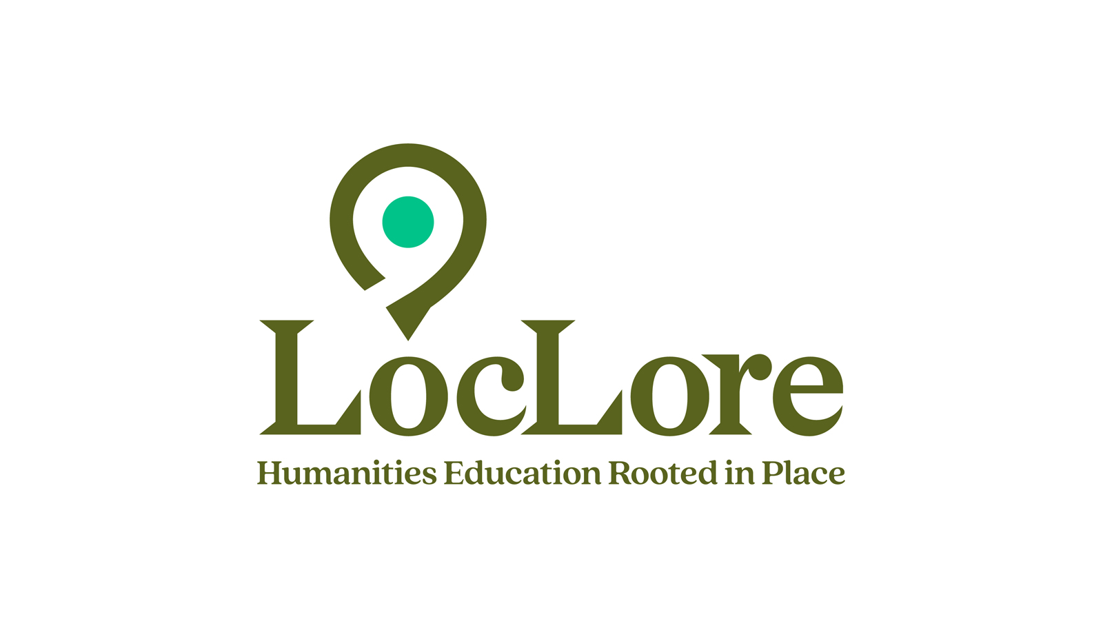
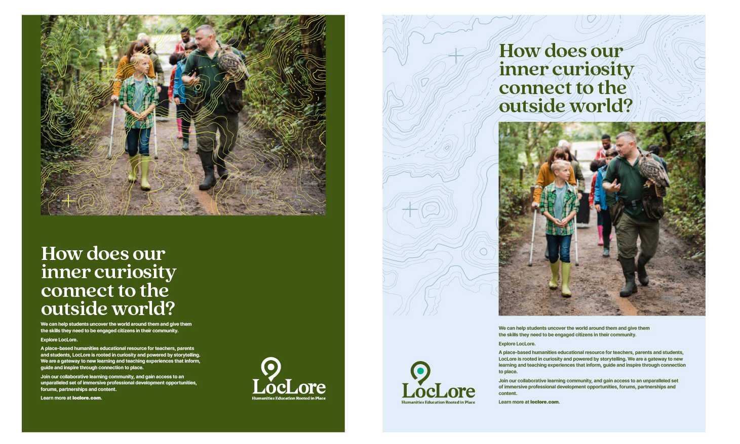
We worked closely with the University Liggett team to brainstorm names, develop an identity and branding framework. The team settled on the name LocLore: “Loc” comes from the word local and evokes a sense of place. “Lore” is taken from the word folklore and encompasses the stories and narratives of communities and cultures. We identified their value propositions and differentiators. We defined the personality and tone and wrote content starters based on those traits.
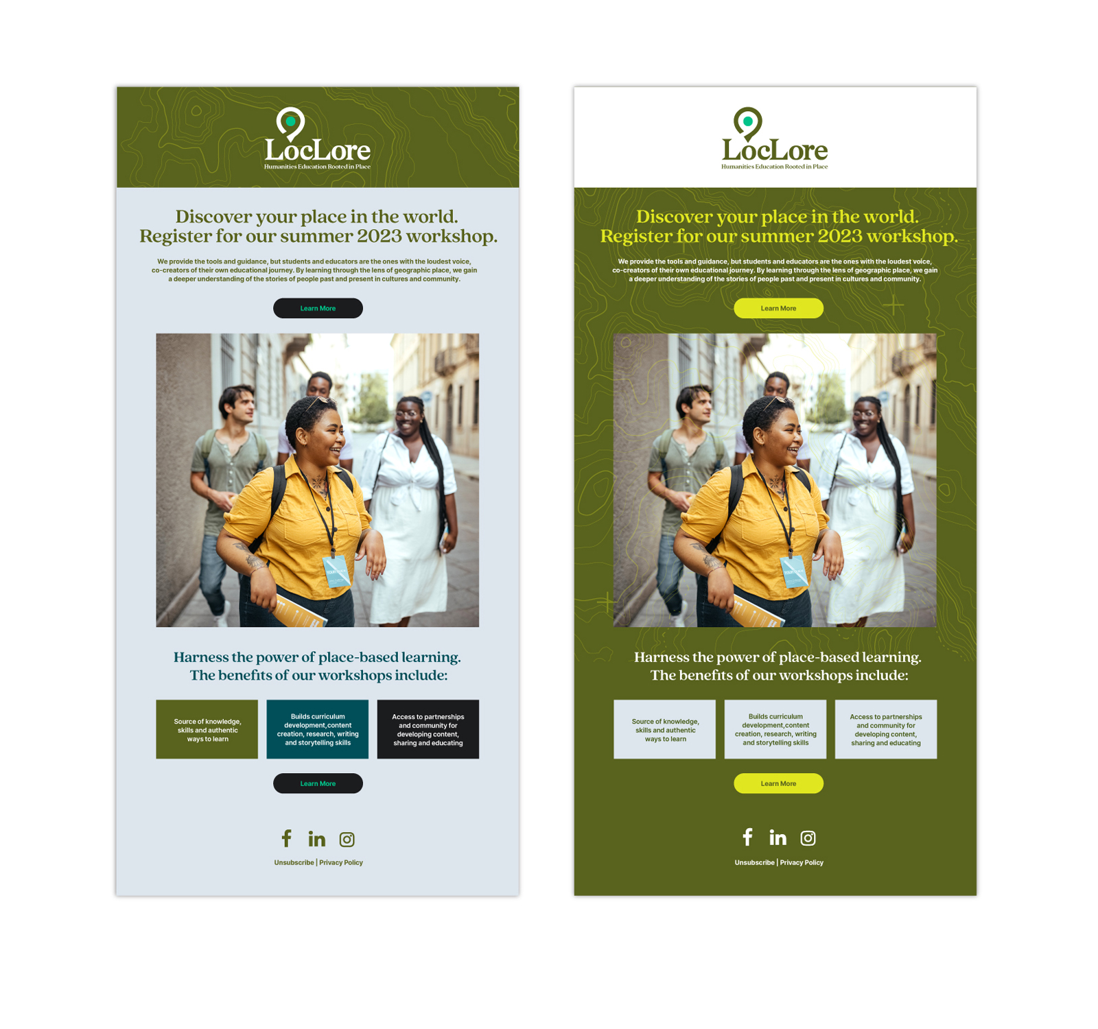
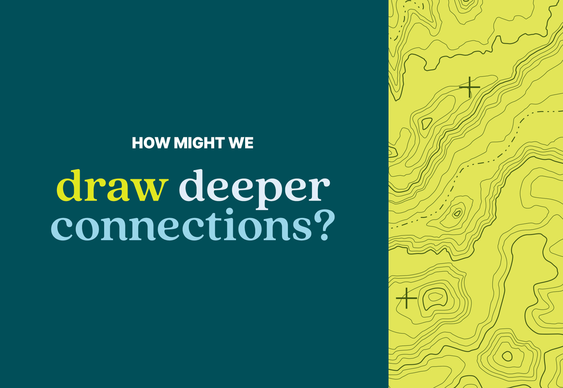
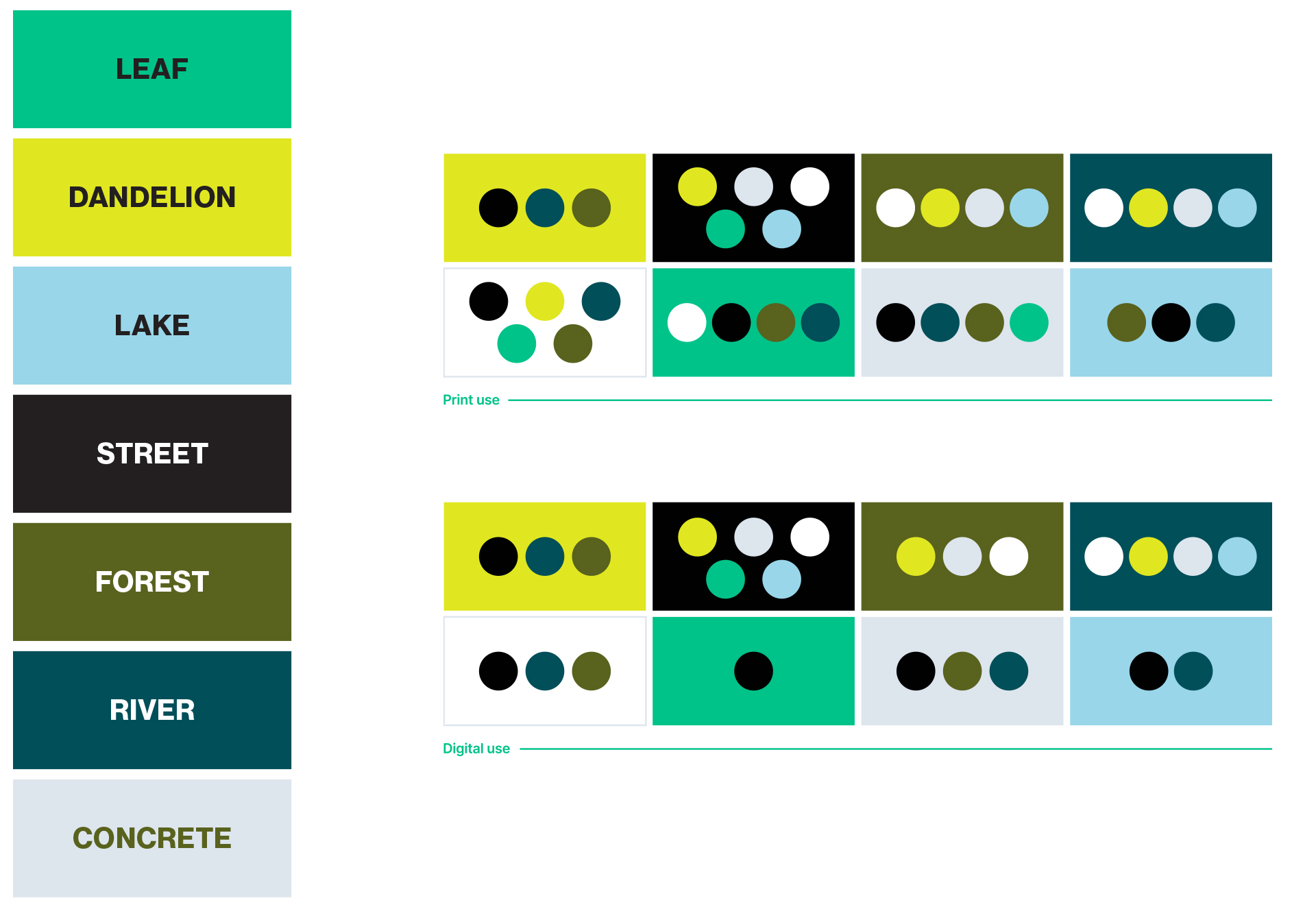
The visual assets of LocLore are rooted in foundational aspects of the brand — place and curiosity. The logo combines a map marker graphic with a question mark. The color palette for LocLore is inspired by our communities — natural shades and concrete gray and black. The typeface’s smooth and flowing letterforms convey a warm and friendly feel, akin to the LocLore personality. The anchor of the design system is the topographic map — or as we call it the Brand TopoGraphic — a map that illustrates the shape and elevation of land surface features by the use of contour lines. The Brand TopoGraphic represents the basis of LocLore — place — and serves as a visual element of exploration, learning through the lens of a geographic place and the path of an educational journey.


Result: A brand ready to change the way educators teach and students learn — and apply — the humanities academic disciplines
The LocLore team loved the branding strategy and visual identity system and were eager to start using the new brand assets. We provided them with a style guide full of tools and guidance such as core brand themes and sample copy, how and how NOT to use the logo, safe color combinations for ADA compliance and many other brand essentials needed to identify, build and grow the LocLore brand across a range of communications and experiences.
Let's work together
Do you need a brand refresh? Consider us for your next adventure into the branding sphere.