Typography
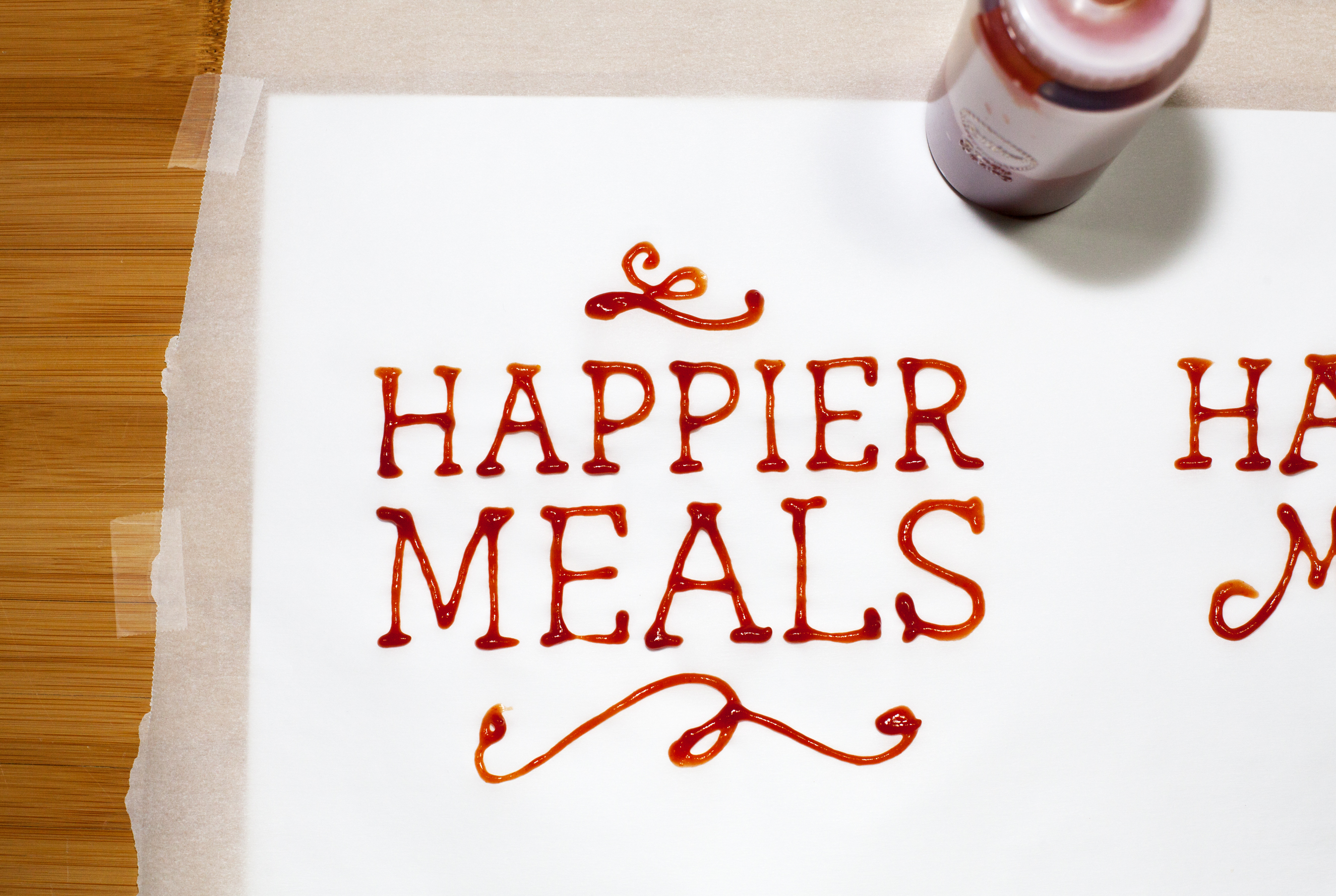
Ketchup Type?

What do you do when you have a feature story about fast food?
You get a squeezy bottle of ketchup, plug your nose and spend the next 6(ish) hours drawing the letters of the headline in America’s favorite condiment.
Food typography was one of the ways we wanted to push the boundaries for a feature story design for The Henry Ford Magazine. By bringing another dimension in and stepping away from the screen, this allowed us to create a design that was authentic, and pushed beyond the obvious.
How can we push the boundaries together?